ART'hur
Motion-led portfolio and living archive for a visual director
In plain English
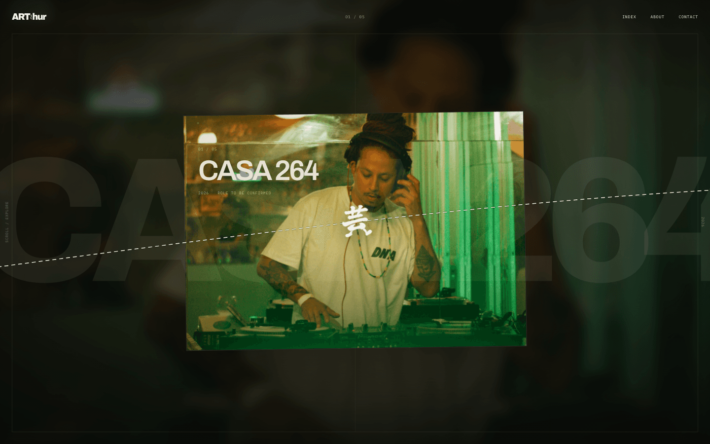
A portfolio site that behaves like a sequence of film scenes instead of a scrollable page — one project fills the screen at a time, and a single scroll notch cuts to the next one like an edit, not a swipe.
My role
Solo full stack developer
Timeline
Ongoing
Team
Solo
Status
In development
Design
Product tour
Section 01
The problem
The starting point was a Next.js and Payload CMS foundation wearing a literal macOS desktop skin — wallpaper, dock, icons, window chrome. It behaved like software demoing itself, not like an archive of a director's actual work, and a generic template grid could never carry the specific rhythm of motion-forward, culturally fluent work.
Section 02
How I approached it
The CMS, data model, and Next.js foundation stayed. Everything public-facing was rebuilt around a studied 'Marked Frequencies' direction, translated from two reference archives rather than copied from either: one fixed, centered project stage where image, atmosphere, title, and metadata morph in place, advanced by a single wheel notch or short touch gesture instead of an open carousel. A dashed white route and a hand-authored 15-frame walking glyph carry the sense of motion instead of a generic loader, and the app cuts between two surfaces — a dark 'room' for media routes and a light 'sheet' for reading — with no cross-fade between them.
Outcome
A live archive at art-hur.vercel.app carrying five real projects, each with production metadata instead of filler copy, where the desktop-simulation shell is gone from every public route, the CMS layer is untouched, and the opening sequence, walker, and morph transition all degrade to a complete, legible page under reduced motion or a failed WebGL context.
Section 03
Going deeper
One stage, not a carousel
The home is a single sticky, centered project stage rather than a horizontal track. A modest wheel notch or short touch-scroll gesture immediately selects the adjacent project and synchronizes the native document anchor to it — the visual transition then completes on its own authored easing rather than being scrubbed frame-by-frame off scroll distance, so the experience reads as a cut between scenes instead of a dragged carousel.
A route and a walker instead of a spinner
A single dashed Newsprint-white line exits both screen edges and breathes as one slow seesaw about a fixed center anchor. An original 15-frame '芸' glyph, capped at 82×82 CSS pixels, rides that anchor: it plays its gait only during the entrance and project transitions, flips when navigating backward, and holds a neutral frame while idle. Neither is decorative chrome borrowed from a template — both are bespoke marks tied to this one archive.
Two surfaces, cut not faded
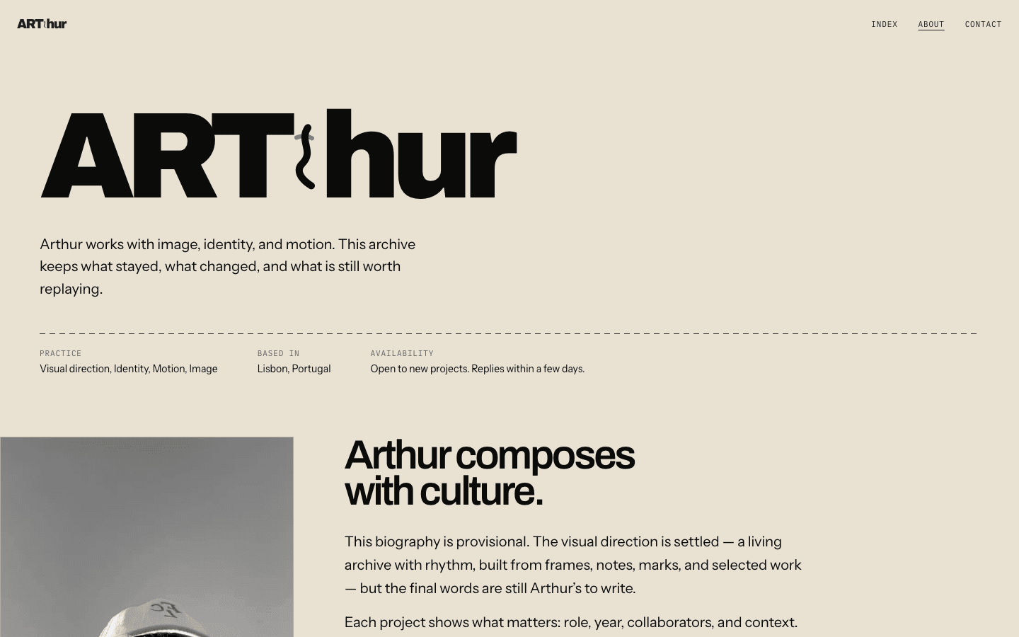
The site declares exactly two surfaces and cuts between them with no cross-route fade: the 'room' (Vinyl Black) for media-led routes, the 'sheet' (Newsprint) for reading. Each interior route stamps `data-surface` on its root element and the global stylesheet paints the canvas to match, so overscroll never bleeds the wrong background color into view.
Section 04
The build process
Strip the shell, keep the foundation
Next.js App Router, Payload CMS, PostgreSQL, and Vercel Blob stayed exactly as inherited. Every literal macOS desktop simulation — wallpaper, lock screen, dock, icons, window chrome — was removed from the public experience before any new visual direction was authored on top.
Build the one-stage navigation
The centered project stage, the wheel/touch-to-anchor gesture sync, and a controlled WebGL morph transition adapted from React Bits' MorphSlider — running on its own easing instead of being tied directly to scroll position.
Author the motion signature
The continuously breathing dashed route, the hand-drawn 15-frame walking glyph, and a restrained WebGL ripple hover layer over the stable active image — suppressed during transitions, reduced motion, and touch-only use.
Interior routes, opening, and SEO
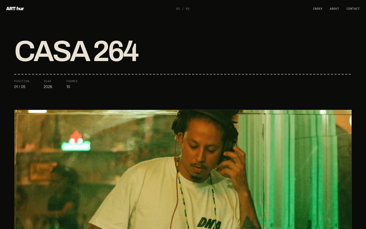
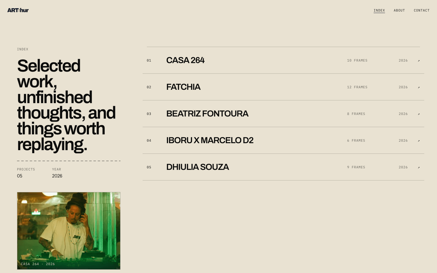
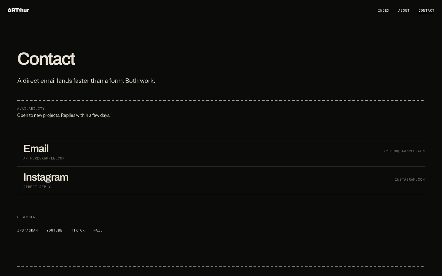
The work case study, contact-sheet index, about, and contact routes; the two-surface room/sheet system; a resilient CSS-only opening sequence; and per-route Open Graph images and JSON-LD generated from the same brand language.
Section 05
How the pieces fit together
Each layer has one job. Read it top to bottom — that's roughly the path a request takes through the system.
Next.js App Router
Public archive routes sharing one app with the Payload admin route group, plus localized routing.
Payload CMS 3
Projects, media, and site settings, publication-gated the way the inherited foundation intended.
PostgreSQL + Vercel Blob
Relational content plus S3-compatible object storage for project imagery.
OGL (WebGL) + GSAP / motion
The centered morph transition and ripple hover run on a controlled OGL renderer; DOM-level choreography runs on GSAP and motion.
Section 06
What it does
One-stage project navigation
A single wheel notch or short touch gesture selects the adjacent project and syncs the document anchor; the transition then completes on its own authored easing instead of being scrubbed by scroll distance.
Dashed route and walker glyph
A continuously breathing dashed line and a hand-authored 15-frame '芸' glyph carry direction and motion instead of a generic spinner or carousel arrow.
Two-surface cut system
Media routes render on a dark 'room' and reading routes on a light 'sheet', with the surface stamped on the route root so overscroll never reveals the wrong canvas color.
Resilient opening sequence
A full-screen CSS-only animation that fills backward from its final visible state, so a failed or skipped animation still renders a complete page rather than a blank one.
Section 07
The hard parts
Decoupling gesture from animation
The wheel/touch input had to commit to the adjacent project on one modest gesture rather than scrubbing shader progress directly off scroll distance, so the transition reads as an edit rather than a scroll-linked effect.
Keeping data and shell separable
The Payload CMS foundation and its data model had to survive completely intact while every public-facing macOS-simulation layer built on top of it was removed.
An overlay that can't fail blank
The full-screen opening sequence is CSS-only and fills backward from a complete final state, so a bug in the animation still renders the finished site instead of hiding it entirely.
Section 08
What I took away
- Studying two reference archives for confidence and pacing, then translating rather than cloning, produces a stronger identity than either source alone.
- An authored motion signature — one specific glyph, one specific line — reads as intentional in a way a generic spinner or carousel never does.
- Building the reduced-motion and WebGL-failure paths alongside the primary experience, not after it, is what keeps the hierarchy legible when the flashy parts are off.
Direction
Marked Frequencies
Navigation
One centered project stage
CMS
Payload 3 + Vercel Blob
Motion
WebGL morph + dashed route
Let's build something worth shipping
Available for freelance projects, full-time roles, and technical consulting. Tell me what you're building and I'll tell you honestly whether I'm the right person for it.
Based in Rio de Janeiro, Brazil · Working with teams in any timezone · Fluent in English and Portuguese